So recently I’ve run into this trend where I start an application and on my task list the word “Dashboard” appears. This word brings excitement and dread at the same time. Below are what I consider the 3 major rules when making a good dashboard.
What is a Dashboard?
Dictionary.com describes a dashboard for computers as
a user interface or Web page that gives a current summary, usually in graphic, easy-to-read form, of key information relating to progress and performance, especially of a business or website
This definition is okay but what’s more interesting is the one for automobiles
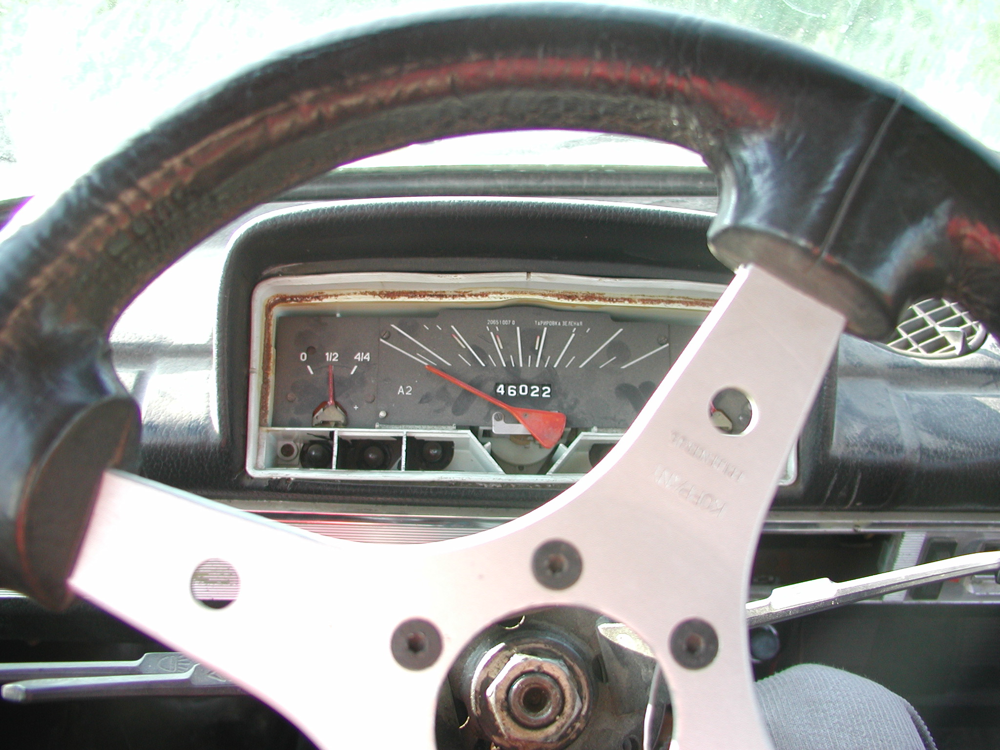
(in an automobile or similar vehicle) a panel beneath the front window having various gauges and accessories for the use of the driver; instrument panel.
When we describe a dashboard for a car, we use gauges, accessories, and instrument panel. When we talk about a dashboard for a computer we describe it with summary, easy-to-read form, and graphics. In the former, the descriptive words offer us a sense of utility and functionality. In the latter, the descriptive words just give us something that looks pretty.
Why the Difference?
Computer science is as much about technical topics as it is about converting metaphors – real life to 1s and 0s. Some of the best discussions I have ever had were about modeling against real world situations and figuring out proper relationships and translating them into code. These discussions are more philosophical than technical as questions are more about the what than the how. “What is a table?” is really more important than “How do we optimize table production?” If we can figure out what exactly a table is, production optimization should hopefully be obvious.
So when we look at the metaphor translation of a dashboard, why does it seem completely lost in translation? The concepts of gauges, accessories, and instrument panels get replaced by a bunch of pie and line charts that look pretty but offer us nothing more. We’ve transformed a dashboard, something that we interact with, to something that produces pretty looking reports and is passive requiring no interaction.
Rules Through Examples
Instead of just making a list of things a dashboard really should have I thought it would be better to explain it through the proper metaphors.
Example: Speedometer
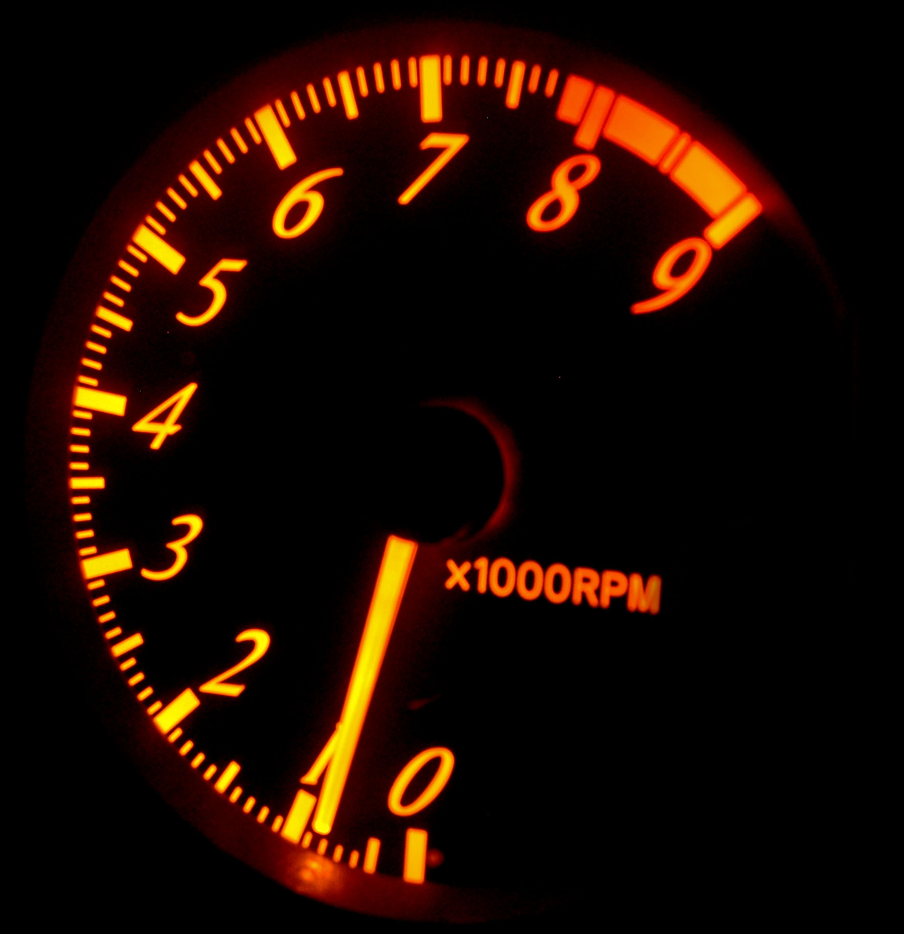
Since we should be modeling computer components against real life, we’ll look at car’s dashboard and compare it to what we see on a computerized version. On a car’s dashboard you have a speedometer. The speedometer lets you know your current speed. If your speed is too fast, you take your foot off the accelerator and maybe even apply the brake. If you are going slow, you know you can put your foot on the accelerator and increase your speed until the speedometer value hits the speed limit. This creates a feedback loop between our foot, the accelerator, maybe the brake, and the speedometer.
In your office on your corporate homepage you probably have a chart that may depict the days revenue, service center calls, or some other important metric. You will see a whole bunch of rates per minute, per second, or some other kind of time frame. The problem here is while we get the same kind of tracking we get with a speedometer, the speedometer itself is useless unless we’re interacting it with our foot on the pedals. The speedometer value means nothing if we just floor it. The cop that pulls us over will give us an official speed reading when he hands us a speeding ticket. So unless your corporate dashboard comes with a button you can press that lights a fire under the butts of your employees to make them work harder, you’ve lost the feedback loop that makes the speedometer useful.
Rule 1: Your dashboard needs to facilitate and contribute to the feedback loop.
Example: Odometer
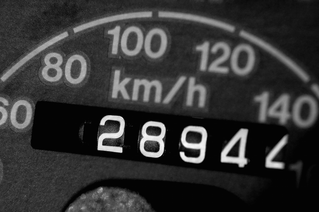
So while the speedometer lets us know our instantaneous speed, we have other instruments such as the odometer that let us know how many miles the car has driven. This allows us to schedule repairs when we’ve driven a certain number of miles and provide us with a reference point we can use while driving. We can track if we’ve driven ten miles by looking to see the odometer value increase by ten.
Back to the corporate dashboard, we’ll see charts and graphs that try encapsulate the same thing. We’ll see roll up graphs and charts that show the total revenue to date. Hopefully it looks like an increasing line and that business is going well. The problem is, if you asked someone what the total revenue is, they probably could tell you after finding the graph, looking at it, and then pointing to the right most data point. In this case we’ve created a really great visualization and could even be creating a really compelling story, but the utility compared to the single value odometer is gone. When you look at it closely, the single odometer value can tell us a lot without much thought. If we know the age of the car, we can get a great idea at how hard the car has been driven. Just with the odometer reading, we can make pretty educated assumptions at which maintenance services have been performed. This single value is really powerful.
Rule 2: Sometimes a single value is all you need – Less can be more.
Example: Radio
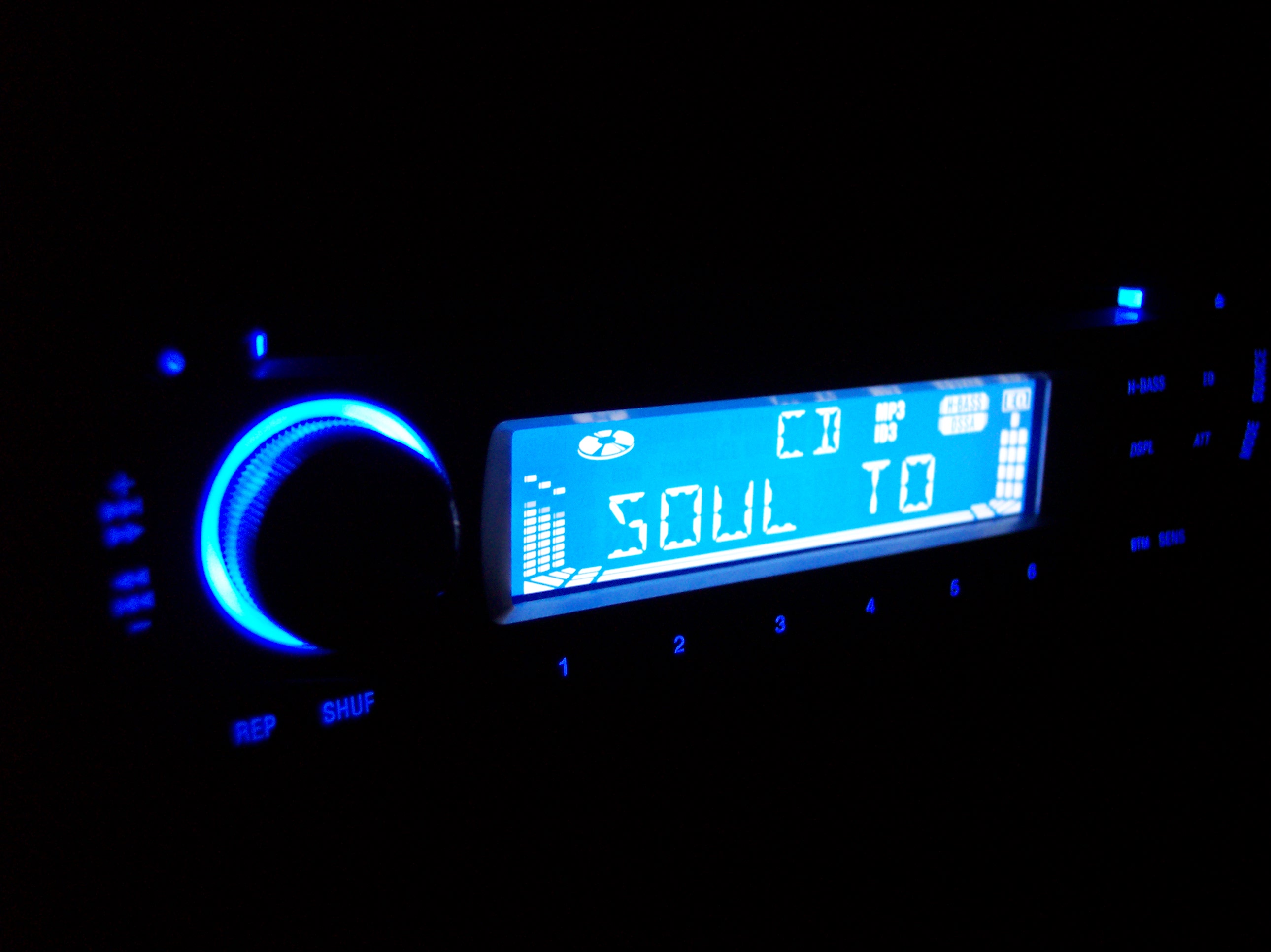
So the odometer and speedometer are right in front of your face. The radio on the other hand is off on the side. It’s made accessible but it is not in your face. You know how to tune to a new station with the buttons and can generally do so without having to take your eyes off the road and off the speedometer and odometer. The radio is an accessory and it bring you joy as you listen to your favorite song while driving. If there was no radio, everything would still work.
Navigational elements on the corporate dashboard tend to be kept out of the way, on the edges or even out of site. This is one thing that’s been done right. I’ve been a proponent of not just doing something because everything else has it that, but having a navigation menu on the left edge or top really can make a lot of sense. What doesn’t make sense though are the non-essential functions that are present on the screen. If you move the non-essentials from the center of your screen, most dashboard would look empty. That graph with real-time data that you have on the screen because it looks cool should be gone. That nonsense chart that you have because the chart looks like a pretty flower should also be gone. That map showing you where everyone is – what value is that really providing? If we keep the main working area of a dashboard clean without any garbage, the amount of widgets present dramatically decrease allowing the user to ultimately focus on what’s important. If they want the extra stuff, it should be on the side, accessible, without losing focus on what matters. A car dashboard overall contains only a few important gauges and instruments. Your dashboard should have the same number. Cramming things on the screen does nothing but make noise and reducing how easily your user can consume the information you want them too. They will get distracted by the animations and noise. And just like with a car, if the person is distracted, accidents can and will happen.
Rule 3: Clean design is both trustworthy and more efficient.
Summary of Rules
- Your dashboard needs to facilitate and contribute to the feedback loop.
- Sometimes a single value is all you need – Less can be more.
- Clean design is both trustworthy and more efficient.
If you follow these three rules you’ll be on your way to creating compelling and efficient dashboards and replace all that dread with pure excitement!


